
User experience optimization is all about making a digital product—like your website or app—as intuitive and enjoyable to use as possible. It's both an art and a science, blending deep empathy for the user with data-driven improvements to smooth out their journey, keep them engaged, and ultimately, help you hit your business targets.
Why User Experience Optimization Is a Business Superpower

Let's cut through the jargon. UX optimization isn't some fluffy design task; it's a core business strategy. When done right, it directly fuels revenue, builds fierce customer loyalty, and shapes how people see your brand. It turns your digital presence from a simple tool into a genuine growth engine.
Think of it like a physical retail store. A shop with clear signs, logical aisles, and helpful staff makes it easy for customers to find what they need. That great experience makes them want to stick around, buy more, and come back. Now, picture a cluttered, confusing store—it's frustrating, right? People leave, and sales are lost. Your website or app is no different.
The True Impact on Your Bottom Line
Great user experience optimization isn't just about making things look pretty; it delivers real, measurable results. When you focus on what the user needs, you see significant gains across the board. For a deeper dive into the strategic side, this Customer Experience Optimization Guide is an excellent resource.
A smooth digital journey accomplishes several critical goals:
Boosts Conversions: By clearing away obstacles like a clunky checkout process or hidden information, you make it incredibly easy for people to take the action you want them to take.
Increases Customer Loyalty: A positive, hassle-free experience builds trust and makes people want to return. In fact, one study found that 75% of consumers judge a company's credibility based on its website design alone.
Reduces Support Costs: When your site is easy to navigate, people don't get stuck. This naturally leads to fewer support tickets and frustrated phone calls, freeing up your team for more important work.
Enhances Brand Perception: A polished, user-friendly platform sends a clear message: you're professional, and you care about your customers. That builds a powerful brand reputation.
In essence, UX optimization is about empathy at scale. It’s the process of deeply understanding your audience's needs, frustrations, and goals, then systematically designing solutions that make their lives easier.
Moving from Guesswork to Strategy
This guide is your roadmap to building that seamless digital experience. We’ll get into the psychology behind why people click (or don't) and unpack the principles, processes, and metrics that separate a good website from a truly great one.
The goal here is to help you move away from making changes based on gut feelings and start making smart, data-backed decisions. This is where you learn to create real value for your users and your business. Let's get started.
Building on the Foundations of Great UX
To really get a handle on user experience optimization, you have to start with the building blocks. Think of it like building a house—you don't start with the roof. You need to pour a solid foundation first, using core principles that make sure everything you build on top is stable, functional, and actually works for the people living inside.
These fundamentals—usability, accessibility, and information architecture—are the non-negotiables of great UX. They all work in harmony to create a product that feels seamless and intuitive, turning what could be a frustrating chore into an effortless experience.
Making Your Product Effortless to Use
At its core, usability boils down to one simple question: how easy is this thing to use? A highly usable website lets a brand-new visitor figure out what to do and get it done without getting confused or needing a user manual. It just makes sense.
Imagine trying to find a book in a library where all the books are just piled randomly on the floor. It would be a nightmare. A usable product is more like a well-organized library with clear signs and a logical system—it guides you right where you need to go.
This is why great usability often goes unnoticed. When a product is truly easy to use, people don't even think about the design; they just focus on achieving their goal.
Designing for Everyone with Accessibility
Accessibility is all about making sure your product can be used by everyone, regardless of their physical or cognitive abilities. This means designing for people with visual, auditory, motor, or cognitive impairments. It's about building digital spaces that are truly inclusive.
For instance, adding descriptive alt-text to your images lets screen readers describe what’s happening visually for users with vision loss. In the same way, making sure your site can be fully navigated with just a keyboard helps people who can't use a mouse. A big part of great UX is understanding the powerful connection between web accessibility and user experience in creating inclusive designs.
Accessibility isn't just a feature or a box to check for compliance. It's a core tenet of good design that not only expands your audience but also shows a real commitment to inclusivity. Plus, it often makes the experience better for everyone by leading to clearer, more robust interfaces.
Organizing Information Logically
Information architecture (IA) is the hidden framework of your site—the art and science of organizing content in a way that feels logical and intuitive. It's the blueprint for your website or app.
A supermarket is a perfect analogy for good IA. Aisles are clearly labeled (Dairy, Produce, Canned Goods), and things that belong together are grouped together. You don’t find milk next to the cereal. This logical structure helps you navigate a huge, complex space and find exactly what you need without wasting time. Your website's navigation, categories, and labels do the exact same job. Good IA keeps people from getting lost.
Getting these fundamentals right has a massive financial upside. For every $1 invested in UX design, companies report an average return of $100. That's an incredible 9,900% ROI. This happens because a good experience directly shapes user behavior, which is why 77% of brands now see customer experience as a major competitive differentiator.
A Continuous Cycle of Improvement
Finally, you need to remember that user experience optimization isn't a "set it and forget it" task. It’s a continuous loop of researching, designing, testing, and tweaking. User expectations are always changing, technology moves forward, and new business goals pop up.
By constantly returning to this cycle, you ensure your product stays relevant, effective, and delightful to use. And since getting found is part of the experience, understanding keyword strategy is key. You can learn more in our guide on how many keywords per page you should aim for. This iterative, always-improving approach is what separates good products from the truly exceptional ones.
A Practical Workflow for UX Optimization
Knowing the principles of user experience optimization is one thing, but actually putting them into practice is another story entirely. That’s where a clear, repeatable workflow comes in. It turns UX from a fuzzy concept into a structured, systematic way to make continuous improvements.
Think of it as your roadmap. Instead of guessing what might work, a solid process guides you toward uncovering real user problems and building solutions that are grounded in data. It’s the difference between throwing spaghetti at the wall and surgically addressing the issues that truly matter. Without it, teams often make changes that look nice on the surface but don't actually move the needle on engagement or conversions.
At its core, the process is a simple, looping cycle: discover, create, and validate.
The infographic below neatly breaks down this cycle, showing how you move from initial research all the way through to design and testing.
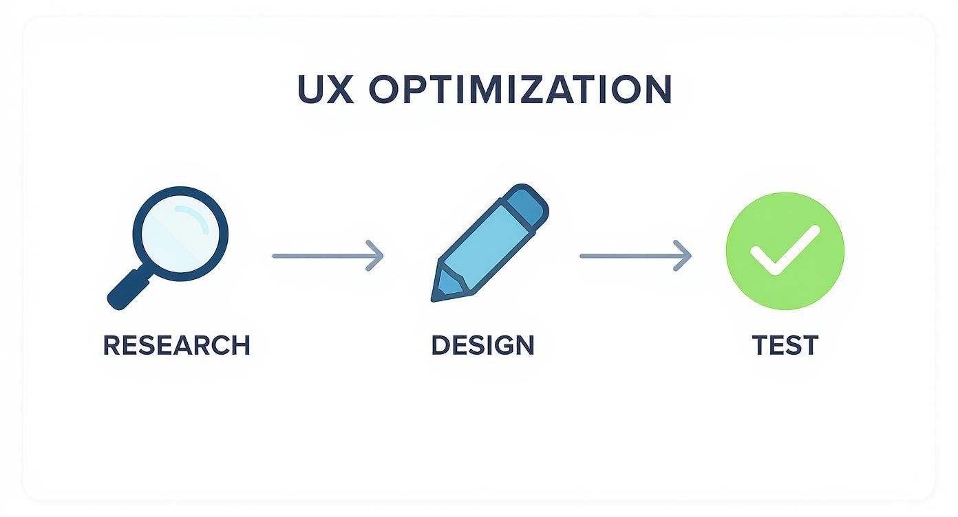
What this really drives home is that UX optimization isn't a one-and-done project. It's a continuous loop where the insights you gain from testing feed right back into the next round of research and design.
Stage 1: Uncovering Insights with User Research
Every meaningful UX project starts with research. This is where you put your assumptions aside and dig into who your users really are, what they need, and where they’re getting stuck. You have to put on your detective hat and gather clues before you even think about solving the case.
The best research combines a few different methods to get the full picture:
User Interviews: There’s no substitute for a direct conversation. Talking to people in your target audience gives you those rich, qualitative insights into their motivations and frustrations that raw data can never provide.
Surveys: Need to spot trends or validate an idea with a larger group? Surveys are a fantastic and efficient way to gather quantitative feedback at scale.
Analytics Review: Tools like Google Analytics show you what users are doing on your site. You can instantly see pages with shockingly high bounce rates or the exact spot where people abandon the checkout process, pointing you directly to the problem areas.
The main goal here is to build genuine empathy for your users and create a solid, data-backed foundation for everything that follows. This is also where you'll pick up on the specific language your audience uses—a goldmine for both UX and SEO. Understanding their intent helps you find the very specific phrases they search with. To go deeper on this, check out our guide on long-tail keyword research.
To keep this process organized, we can map out the core stages in a simple table.
Core Stages of the UX Optimization Cycle
This table provides a high-level look at the iterative process, outlining what you're trying to achieve at each stage and the key activities involved.
Stage | Primary Goal | Key Activities |
|---|---|---|
1. Research | Understand user needs, behaviors, and pain points. | User interviews, surveys, analytics review, competitor analysis. |
2. Analysis | Synthesize research into actionable insights. | Creating user personas, journey mapping, identifying key friction points. |
3. Design | Brainstorm and create potential solutions to identified problems. | Ideation sessions, sketching, wireframing, creating low-fidelity prototypes. |
4. Testing | Validate solutions with real users before full development. | Usability testing, A/B testing, gathering user feedback on prototypes. |
5. Implementation | Build and launch the validated, user-centered solution. | Front-end and back-end development, QA testing, deployment. |
6. Measurement | Track the impact of the changes and gather new data. | Monitoring key metrics (conversion, bounce rate), collecting feedback, analytics review. |
As you can see, the "Measurement" stage flows directly back into "Research," creating the continuous improvement loop that is essential for effective UX optimization.
Stage 2: Visualizing the User Journey
Once you have a pile of research, the next step is to make sense of it all. You need to turn those raw notes and data points into something the whole team can understand and rally behind.
A customer journey map is an incredibly powerful tool for this. It’s a visual story of a user's entire experience as they try to accomplish a goal with your product or service. It lays out every step, from the moment they first hear about you to when they become a loyal customer, capturing their actions, thoughts, and feelings along the way.
This process is crucial because it pinpoints the exact moments of friction. By identifying where users feel confused, frustrated, or uncertain, you can focus your optimization efforts on the areas that will have the biggest impact.
For instance, a journey map for an e-commerce store might show a major dip in user confidence right at the checkout page. Digging in, you might discover it’s because the shipping costs aren't displayed until the very last step. Boom. You've just found a clear, high-impact problem to solve.
Stage 3: Designing and Testing Solutions
With a clear problem in hand, it's time to get creative and start building solutions. This stage is all about quick, iterative cycles of creation and validation, ensuring you don’t waste months building something nobody wants.
Here’s how it usually plays out:
Ideation: Get the team together and brainstorm a wide variety of solutions. Don't settle on the first idea; the goal is to explore different angles and possibilities.
Prototyping: Create a simple, low-fidelity version of your best idea. This can be anything from a sketch on paper to a clickable wireframe. The point is to make the concept tangible enough to test without sinking a ton of time and money into it.
Usability Testing: Now, put that prototype in front of real users. Give them a task to complete and just watch. Listen to what they say, and more importantly, pay attention to where they struggle. This is your moment of truth—does your solution actually work?
Based on that feedback, you’ll tweak the prototype and test it again. This build-measure-learn loop continues until you’ve landed on a solution that demonstrably works. Only then is it ready for the development team. This deliberate approach takes the guesswork out of design and makes sure you’re building something that delivers real value.
How to Measure What Matters in UX
https://www.youtube.com/embed/UTNv6CNv82E
Great user experience optimization isn't about guesswork or following your gut. It's a science, and it’s driven by cold, hard data. If you want to know whether your design changes are actually making a difference, you have to measure what matters.
This means looking past the surface-level numbers and homing in on the metrics that reveal how people really interact with your product and—just as importantly—how they feel about it.
When you measure effectively, you can finally prove the ROI of your UX work, get buy-in for future projects, and build a powerful business case for putting users first. The trick is to split your metrics into two camps that tell a complete story: what users do and what users say.
Tracking What Users Do with Behavioral Metrics
Behavioral metrics are all about action. They give you objective, quantitative data on how people are actually navigating and using your website or app. These numbers are gold because they show you the unfiltered truth of user behavior, without any personal opinion or bias getting in the way.
Here are some of the most essential behavioral metrics to keep an eye on:
Task Success Rate (TSR): What percentage of users actually complete a specific goal? This could be anything from signing up for a newsletter to finishing a checkout. A low TSR is a huge red flag that something in your user flow is confusing or just plain broken.
Time on Task: How long does it take someone to get something done? Usually, less time is better, suggesting an intuitive and efficient design. Of course, this depends on how complex the task is meant to be.
Error Rate: This tracks how often people mess up while trying to complete a task, like fumbling a password or entering a credit card number incorrectly. A high error rate points you directly to the spots in your interface that are causing friction and frustration.
Conversion Rate: This is the ultimate bottom-line metric. It’s the percentage of users who take that one action you really want them to, like making a purchase or filling out a lead form. Nearly every UX optimization effort is aimed at lifting this number.
These metrics paint a clear, data-driven picture of your product's real-world usability. They show you exactly where the user journey is a smooth highway and where it’s full of potholes.
Understanding What Users Say with Attitudinal Metrics
While behavioral metrics tell you what is happening, attitudinal metrics explain why. These are the qualitative insights that capture your users' feelings, opinions, and perceptions about the experience you’ve built. They provide the crucial context that raw numbers can never give you.
Attitudinal data is the voice of the customer. It helps you build empathy and understand the emotional side of the user experience, turning anonymous data points into human stories.
You'll typically gather this feedback through surveys, interviews, and feedback forms. The key metrics include:
Net Promoter Score (NPS): A classic for a reason. It asks a single, powerful question: "On a scale of 0-10, how likely are you to recommend our product to a friend or colleague?" It's a fantastic gauge of overall customer loyalty.
Customer Satisfaction (CSAT): Usually measured with a simple scale ("How satisfied were you with your experience today?"), CSAT gives you an immediate pulse check on user sentiment right after a specific interaction, like chatting with support or completing a purchase.
System Usability Scale (SUS): This is a standardized 10-question survey that delivers a reliable, high-level score for your product's overall usability.
You simply can't overstate the role of user feedback in UX optimization—it’s the compass that guides your every move. Metrics like task success rate and NPS provide objective benchmarks for how intuitive and satisfying a product feels. This is especially true for mobile, where responsive design and speed are king; even a one-second delay can send bounce rates through the roof. The pressure is on, as 70% of Gen Z users now expect websites to anticipate their needs, forcing companies to treat UX optimization as a core business function. You can find more UX optimization best practices on survicate.com.
A Balanced Approach to Measurement
Here’s the thing: neither behavioral nor attitudinal metrics can tell you the whole story on their own. The real magic happens when you bring them together.
For example, your analytics might show a high cart abandonment rate (a behavioral metric). That tells you there's a problem, but it doesn't tell you why. It’s the user feedback (an attitudinal metric) that reveals people are leaving because of unexpected shipping costs at the final step.
By tracking both what users do and what they say, you get a complete, 360-degree view of your user experience. This balanced approach is the key to diagnosing problems accurately, prioritizing fixes that will have the biggest impact, and building a product that doesn't just work well, but feels great to use.
Real-World Examples of Winning UX
Theory and workflows are great, but the real magic of user experience optimization happens when you see it in action. Studying how successful companies have tackled real-world user problems gives you a powerful playbook for your own challenges. These stories prove that putting users first isn't just about making things look nice—it's a direct line to serious business growth.
When you connect the dots from a specific user pain point to a clever UX solution, the impact is undeniable. You see cart abandonment plummet and user activation soar.
Let's dive into a few examples that show how small, user-focused changes can lead to massive wins.
Simplifying the Path to Purchase
One of the most notorious friction points online is the checkout process. A major e-commerce retailer was staring down an alarmingly high cart abandonment rate. A quick look at their analytics revealed a classic conversion killer: users were bailing the second they were asked to create an account.
The problem was obvious. Forcing users to sign up was a roadblock, adding extra steps and mental load right when they were ready to hand over their money.
Their solution was brilliantly simple: they introduced a guest checkout option. Shoppers could now complete a purchase with just an email address and payment details. That’s it. They removed the single biggest obstacle in the user’s path.
The results were immediate and staggering:
Cart abandonment dropped by over 25% in the first quarter.
Mobile conversions shot up, since the streamlined flow was far easier on smaller screens.
Overall sales grew by an estimated $300 million in the first year alone.
This case is the perfect illustration of how removing one point of friction can completely change the game for your bottom line. It’s a masterclass in prioritizing user convenience over data collection at the most critical moment.
The design and usability of your website are your digital handshake. A staggering 75% of consumers admit to judging a company’s credibility based on its website design. For e-commerce, it's even more critical: 93% of shoppers expect an online experience that's just as good, if not better, than an in-person one. Get it wrong, and you could join the businesses that report an average 35% drop in sales due to poor UX.
Redesigning Onboarding for Engagement
For any SaaS platform, the first few minutes a user spends with your product are make-or-break. A popular project management tool was struggling with this exact problem—new sign-ups would log in once and never come back.
After digging into user interviews and session recordings, they found the culprit: their onboarding process was a firehose of information. It was a long, front-loaded product tour that explained every single feature at once, leaving new users totally overwhelmed and unsure what to do next.
So, they scrapped the generic tour and built a new onboarding experience that was contextual and action-oriented. Instead of watching a video, new users were guided through setting up their very first project, one step at a time. Tooltips and checklists appeared as they engaged with key features, teaching them by doing.
The outcome was a massive success. The company saw a 40% increase in user activation within the first week of signing up. By helping users get a small win right away, they proved the product's value and created the momentum needed for long-term engagement. This principle is not just for SaaS; it's also crucial for local businesses aiming to provide a clear path for customers, as outlined in our local SEO checklist.
The Power of Small, Iterative Fixes
Not every UX win has to be a ground-up redesign. Sometimes, the smallest tweaks can have an outsized impact.
Take Costa Coffee, for example. They discovered that password entry issues in their app were a major roadblock during registration. By simply fixing that one small but frustrating bug, they boosted app registrations by 15%.
These examples all point to the same truth: great user experience optimization is rooted in empathy. It’s about finding where your users are getting stuck and making their lives just a little bit easier. Whether it’s a streamlined checkout, a smarter onboarding flow, or a tiny bug fix, the goal is always the same—create a smoother, more intuitive journey.
Common Questions About UX Optimization
When you first start digging into user experience optimization, a few practical questions almost always pop up. How is this different from all the other design work we're doing? Is this just for big companies with endless budgets? What tools do I actually need to get my hands dirty?
Let's cut through the noise and tackle those common questions head-on. My goal here is to give you clear, straightforward answers so you can confidently apply these principles to your own projects, no matter how big or small.
What Is the Difference Between UX and UI?
This is probably the most common question I hear, and for a good reason. User Experience (UX) and User Interface (UI) are deeply intertwined, but they are absolutely not the same thing. Getting this distinction right is the first real step toward creating a product that people genuinely love to use.
The best analogy I've found is building a house.
UX is the architectural blueprint. It’s the deep thinking that goes into the foundation, the room layouts, and how a family will actually move through the space. It answers questions like: Does the kitchen flow logically into the dining area? Is it easy to get from the bedrooms to the bathrooms? It’s all about the structure and the overall feeling of living in that home.
UI, on the other hand, is the interior design. It's the paint colors, the furniture, the light fixtures—all the tangible, visual elements that bring the blueprint to life. A gorgeous living room (great UI) is fantastic, but if the house itself has a bizarre, confusing layout (poor UX), the experience will always be frustrating.
In a nutshell: UX is about the entire journey and how it works. UI is about the visual touchpoints and how it looks. You need both to succeed, but a beautiful interface can never save a fundamentally broken experience.
How Can Small Businesses Afford UX Optimization?
It's a pervasive myth that UX optimization is a luxury reserved for massive companies with dedicated research teams and labs. The truth is, any business can make huge strides by starting small and focusing on high-impact, low-cost activities.
You don't need a fancy, two-way mirror and a bunch of expensive equipment. Here are a few practical ways to get started on a shoestring budget:
Just talk to your customers. Seriously. A 15-minute conversation with just five users can uncover a goldmine of pain points. Ask them to share their screen and walk you through how they use your site. Then, listen.
Use free analytics. Google Analytics is an incredibly powerful—and free—tool. It can show you exactly which pages are causing people to leave your site. A high bounce rate on a key page is a giant red flag telling you exactly where to look first.
Run "hallway" usability tests. Grab a colleague from another department or even a friend who isn't familiar with your site. Ask them to complete a simple task, like finding a product or signing up. Just watch where they get stuck. This simple act of observation can reveal major flaws you're blind to.
The secret is to focus your limited resources on solving the biggest problems first. Small, data-informed tweaks often deliver the most significant results, proving that a big impact doesn't require a big budget.
What Are Some Essential Tools for UX?
While your strategy and thinking are far more important than any single piece of software, the right tools can certainly make your life easier. The great news is that many of the best ones have generous free plans, so you can build a solid toolkit without spending a dime.
For most individuals or small teams, a handful of tools can cover your entire workflow:
For Understanding User Behavior: Start with Google Analytics to see the "what." Then, to understand the "why," use a tool like Hotjar. Its heatmaps visually show you exactly where people are clicking, moving their mouse, and scrolling. It’s like looking over their shoulder.
For Designing and Prototyping: Figma has pretty much become the industry standard for a reason. It’s fantastic for everything from rough wireframes to polished, interactive prototypes. Its free plan is incredibly generous and perfect for getting started.
For Gathering Feedback: You don't need anything complex. Simple survey tools like SurveyMonkey or Typeform are perfect for quickly asking users what they think.
The best approach is to start simple and free. As your process matures and your needs grow, you can then decide if it's worth investing in more advanced platforms.
How Often Should My Business Optimize UX?
UX optimization isn't a one-and-done project you check off a list. Think of it as a continuous cycle that adapts as your business grows, your customers' needs change, and technology evolves. What felt intuitive and modern last year can easily feel clunky and dated today.
As a general rule, it's wise to conduct a major UX audit at least once a year or before any big redesign.
But the most successful companies don't wait for a big event. They weave UX into their regular rhythm of business—constantly monitoring metrics, gathering feedback, and making small, iterative improvements every month or quarter. This approach of continuous, small-scale optimization is far more effective than waiting years for a massive, costly overhaul. It keeps your product relevant and consistently aligned with what your users actually need.
Ready to stop guessing and start building a content strategy that drives real growth? Viral SEO gives you the tools to analyze your competition, find high-impact content ideas, and optimize your pages with a clear, data-driven workflow. Ditch the scattered spreadsheets and discover a faster way to improve your user experience and climb the rankings at https://getviralseo.com.
Blogs
More Blogs
From keyword goldmines to AI-driven content hacks—expert insights to help your blog posts dominate the first page.


