
In the competitive landscape of SaaS, a landing page is more than just a digital storefront; it's your most critical conversion asset. Yet, many small teams struggle to turn traffic into tangible results, facing high bounce rates and lackluster sign-ups. The problem isn't a lack of effort; it's a lack of a clear, data-driven framework. Generic advice and surface-level tips often lead to wasted resources and missed opportunities, leaving you with pages that attract clicks but fail to convert them into customers.
This guide cuts through the noise. We've compiled a prioritized, actionable collection of landing page optimization best practices designed for immediate impact. Forget vague theories; each point here is a practical step you can take today to improve performance. This blueprint is specifically tailored for SaaS startups, content marketers, and small teams who need efficient, high-leverage strategies that deliver measurable results without requiring a massive budget or dedicated optimization team.
We will cover the essential pillars of a high-converting page, including:
Crafting an irresistible value proposition above the fold.
Implementing a single, focused call-to-action (CTA).
Mastering benefit-driven copywriting and mobile-first design.
Building trust with social proof and optimizing for lightning-fast load speeds.
These strategies are central to turning visitor interest into action. For a deeper dive into improving the overall effectiveness of your pages, explore strategies for maximizing website conversion rates with CRO. By implementing the following tactics, you will gain the clarity and confidence needed to build pages that consistently drive predictable growth for your business. Let's dive in.
1. Clear Value Proposition Above the Fold
The very first thing a visitor sees on your landing page, the "above the fold" content, is your most valuable digital real estate. One of the most critical landing page optimization best practices is to use this space to present a clear and compelling value proposition. This statement must immediately answer the visitor’s core question: "What's in it for me?" A strong value proposition hooks the user, clarifies your offer's primary benefit, and persuades them to explore further rather than bouncing.
It’s the elevator pitch for your product or service, distilled into a single, powerful headline and sub-headline. This isn't just about describing what you do; it’s about articulating the positive outcome or problem solved for the customer. Think of Slack’s classic "Be more productive at work with less effort." It's concise, benefit-driven, and perfectly clear.

How to Implement This
Crafting an effective value proposition involves a mix of customer understanding, strategic copywriting, and design.
Focus on Benefits, Not Features: Instead of saying "Our software has a real-time analytics dashboard" (a feature), say "Make smarter decisions instantly with real-time data" (a benefit). The benefit is the outcome the user desires.
Keep it Simple and Jargon-Free: Avoid industry buzzwords or technical terms that your target audience might not understand. Clarity trumps cleverness every time. Your message should be understood in five seconds or less.
Use a Headline/Sub-headline/CTA Formula:
Headline: Your main benefit or promise. (e.g., "The Easiest Way to Manage Your Projects")
Sub-headline: A brief explanation of what you do or who it's for. (e.g., "Our intuitive platform helps teams of all sizes plan, track, and deliver work on time.")
Call-to-Action (CTA): A clear next step. (e.g., "Start Your Free Trial")
Key Insight: A great value proposition speaks directly to a user's pain point or goal. By aligning your headline with the search intent that brought them to your page, you create an instant connection and build trust. Understanding user intent is key; you can gain a deeper understanding of this by performing detailed keyword analysis and exploring how to find the right long-tail keywords for your audience. This ensures your message resonates from the very first click.
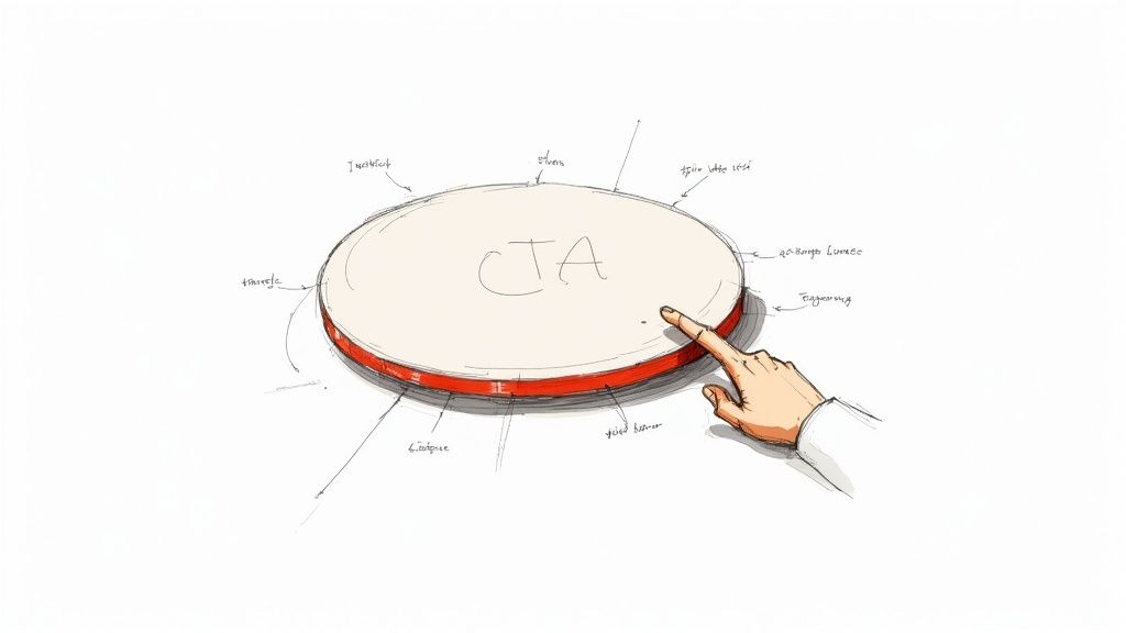
2. Single-Focused Call-to-Action (CTA)
Once you've hooked a visitor with a clear value proposition, the next step is to guide them toward a single, specific action. One of the most impactful landing page optimization best practices is to eliminate choice paralysis by featuring a single-focused call-to-action (CTA). When you present visitors with multiple options, like "Sign Up," "Learn More," and "Contact Us" all at once, you dilute their focus and decrease the likelihood they will take any action at all. A primary CTA creates a clear, frictionless path to conversion.
This principle is about creating an unmistakable "next step." Your entire landing page, from the headline to the social proof, should be built to support and lead the visitor to this one conversion goal. Think of Netflix’s prominent "Start Your Free Month" or Stripe’s direct "Start Now." These CTAs are unambiguous, leaving no doubt about what the user should do next to gain the promised value.
How to Implement This
Designing a CTA that converts requires a combination of compelling copy, strategic design, and thoughtful placement.
Use Action-Oriented, Benefit-Driven Copy: Instead of a generic "Submit," use language that communicates value. Phrases like "Get My Free Ebook" or "Start My Free Trial" are more effective because they use first-person language and highlight what the user receives.
Make it Visually Distinct: Your CTA button should stand out from the rest of the page. Use a contrasting color that draws the eye, ensure the button is large enough to be easily clickable on all devices, and use whitespace around it to prevent visual clutter.
Strategic Placement: Place your primary CTA above the fold and repeat it at natural conclusion points throughout a longer page, such as after a features section or customer testimonials. This ensures the option to convert is always readily available without being intrusive.
Key Insight: The goal is to make the desired action feel like the most logical and effortless next step for the visitor. While you may have secondary, lower-priority links (like "Schedule a demo" in a page footer), your primary conversion goal should be represented by a visually dominant and consistently messaged CTA button. This laser-focus is critical for maximizing conversions.
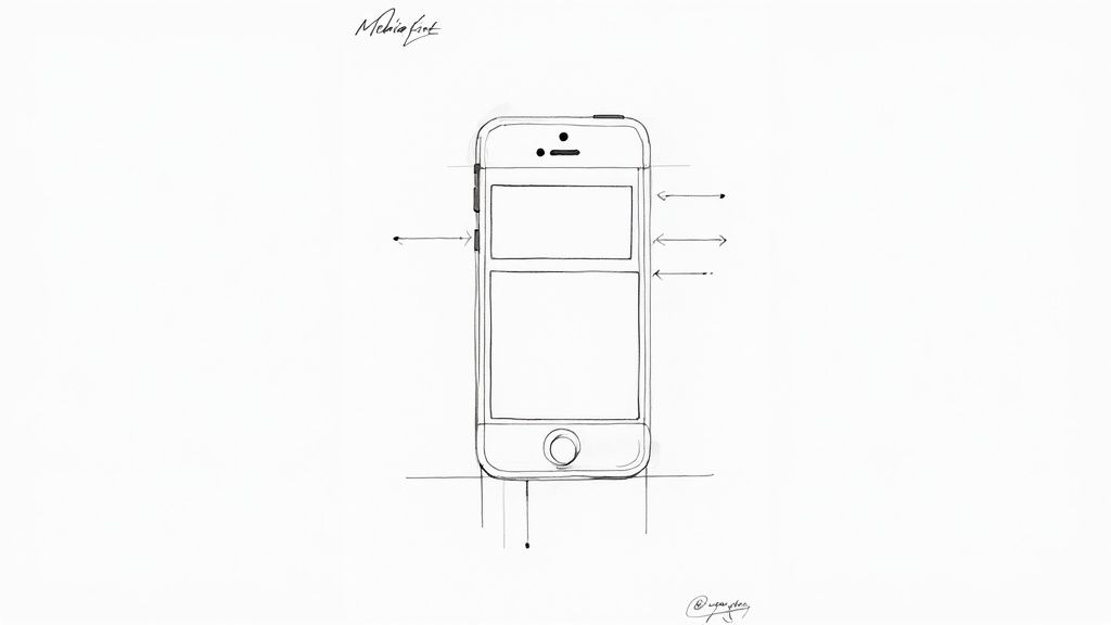
3. Mobile-First Responsive Design
With mobile traffic now accounting for the majority of web visits, designing for the smallest screen first is no longer optional; it's a foundational element of modern landing page optimization best practices. A mobile-first approach means you design the user experience for a mobile device and then adapt it for larger screens like desktops. This strategy forces you to prioritize core content and functionality, leading to a cleaner, faster, and more focused experience for all users, which is heavily favored by search engines like Google.
This approach ensures your landing page is not just usable but enjoyable on a smartphone. It guarantees fast load times, readable fonts without pinching and zooming, and touch-friendly buttons and forms. By focusing on the constraints of a mobile device first, you create a more streamlined and effective page that performs better where most of your audience likely is.
How to Implement This
Implementing a mobile-first design requires a shift in mindset from "graceful degradation" (designing for desktop and stripping features for mobile) to "progressive enhancement" (starting with a core mobile experience and adding features for larger screens).
Prioritize Content Hierarchy: On a small screen, you must decide what is most important. Start by outlining the essential elements: the headline, the primary CTA, and the key benefit. Everything else should be secondary.
Optimize for Touch: Ensure buttons and links are large enough to be easily tapped with a thumb. Use ample spacing between interactive elements to prevent accidental clicks. Forms should use mobile-friendly input types (e.g.,
type="email"ortype="tel").Focus on Performance: Mobile users are often on slower connections. Optimize images, minify CSS and JavaScript, and leverage lazy loading to ensure your page loads in under three seconds. Use tools like Google's Mobile-Friendly Test to regularly check your page's performance.
Key Insight: Mobile-first design isn't just about shrinking a desktop page; it's about rethinking the entire user journey for a mobile context. Since Google's mobile-first indexing uses the mobile version of your page for ranking, a poor mobile experience directly harms your SEO visibility and conversion rates. Always test on actual devices, not just browser emulators, to get a true feel for the user experience.
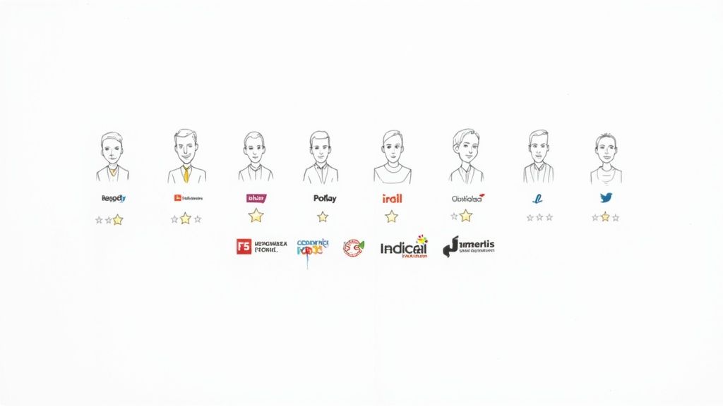
4. Trust Signals and Social Proof
When a visitor lands on your page, they are subconsciously looking for reasons to leave. One of the most powerful landing page optimization best practices is to disarm this skepticism with trust signals and social proof. These elements act as third-party validation, showing visitors that real people and legitimate businesses have found value in your offer, which significantly reduces friction and visitor anxiety.
Social proof leverages the psychological principle that people conform to the actions of others under the assumption that those actions are the correct behavior. By showcasing testimonials, customer logos, positive reviews, or user counts, you demonstrate credibility and build confidence, making a visitor far more likely to convert. For example, Slack effectively uses this by displaying logos of trusted companies like Microsoft and Oracle on its homepage.
How to Implement This
Integrating social proof requires more than just adding a quote; it’s about strategically placing authentic validation where it matters most.
Vary Your Proof Points: Don't rely on just one type of signal. Combine different forms of social proof for maximum impact:
Testimonials: Quotes from happy customers. Use their full name, company, and photo for authenticity.
Customer Logos: Showcase logos of well-known companies you work with.
Reviews & Ratings: Embed ratings from platforms like G2, Capterra, or Trustpilot.
Case Studies: Offer in-depth stories of customer success with measurable results.
Data & Numbers: Highlight metrics like "Trusted by 10,000+ users" or "2 million projects created."
Be Specific and Authentic: Vague praise is forgettable. A testimonial saying "Increased our team's productivity by 30% in two months" is far more compelling than "Great product!" Always use genuine feedback from real customers.
Strategic Placement: Place your strongest trust signals near your primary call-to-action buttons. Seeing a glowing review or a list of impressive client logos right before being asked to sign up can be the final push a user needs to convert.
Key Insight: The authority of your social proof matters. A testimonial from a recognized industry leader carries more weight than one from an unknown source. Similarly, press mentions from high-authority publications act as powerful trust signals. Building relationships and getting featured on reputable sites can dramatically boost your credibility; you can discover how to evaluate the authority of a website to prioritize your outreach efforts.
5. Fast Page Load Speed and Performance
In an era of instant gratification, a slow landing page is a conversion killer. Page load speed is a foundational element of landing page optimization best practices because it directly impacts user experience, bounce rates, and even SEO rankings. If a visitor has to wait more than a few seconds for your content to appear, they are far more likely to abandon the page, meaning your perfectly crafted message will never even be seen.
A fast-loading page keeps potential customers engaged from the first click. Google's own data shows that the probability of a bounce increases dramatically with every second of load time. Companies like Amazon have proven that even milliseconds of improvement can lead to significant increases in revenue. Prioritizing performance ensures you retain visitor attention and maximize the opportunity for conversion.
How to Implement This
Optimizing your landing page for speed involves a series of technical adjustments that collectively reduce the time it takes for a browser to render your content.
Compress and Optimize Images: Large image files are often the primary cause of slow load times. Use modern formats like WebP and tools like TinyPNG to significantly reduce file sizes without sacrificing quality.
Leverage Browser Caching: Configure your server to send caching headers. This allows a visitor's browser to store static assets like images and CSS locally, so they don't have to be re-downloaded on subsequent visits.
Minify Code and Reduce Requests: Use tools to minify your HTML, CSS, and JavaScript, which removes unnecessary characters from the code. Combine multiple CSS or JS files into single files to reduce the number of HTTP requests the browser needs to make.
Use a Content Delivery Network (CDN): A CDN like Cloudflare or Akamai stores copies of your landing page on servers around the world. This ensures that content is delivered to users from a location geographically closer to them, dramatically reducing latency.
Key Insight: Regularly monitor your performance using tools like Google PageSpeed Insights. Pay close attention to Core Web Vitals (LCP, FID, CLS) as these are direct ranking factors and user experience indicators. For even more comprehensive guidance on optimizing load times, explore these detailed tips on how to improve website loading speed. A commitment to speed is a commitment to a better user experience and higher conversions.
6. Strategic Form Optimization
The form on your landing page is often the final barrier between a visitor and a conversion. Strategic form optimization is one of the most impactful landing page optimization best practices because it directly tackles friction at this critical moment. An overly long, confusing, or intimidating form is a primary cause of abandonment. The goal is to make the data submission process feel as effortless and secure as possible for the user.
This practice involves thoughtfully designing every element of your form, from the number of fields to the layout and error messaging. Instead of treating the form as a simple data collection tool, view it as a conversation. As exemplified by Typeform's one-question-at-a-time approach, a well-optimized form guides the user smoothly toward completion, increasing the likelihood they will convert.
How to Implement This
Optimizing your forms requires a user-centric approach focused on minimizing cognitive load and building trust.
Request Only Essential Information: Every field you add increases friction. Start by asking for the absolute minimum information needed to qualify or contact the lead. For example, if you only need an email to send a newsletter, don't ask for a phone number and company name.
Use a Single-Column Layout: Research from CXL Institute shows that single-column forms are typically easier for users to scan and complete than multi-column layouts. This linear path reduces the mental effort required to process the form.
Implement Smart Fields and Validation:
Field Masking: Automatically format inputs for things like phone numbers or credit cards to guide users.
Inline Validation: Provide real-time feedback as a user fills out the form, showing a green checkmark for correct entries or a clear error message for incorrect ones, preventing frustration upon submission.
Progressive Profiling: Use tools like HubSpot or Intercom to gather more information over time. On the first conversion, ask for a name and email. On their next visit, your form can recognize them and ask for their company size or job title.
Key Insight: The perceived effort of a form directly impacts its completion rate. Reduce friction by clearly labeling fields, using placeholder text as a guide (not a label), and ensuring your call-to-action button is prominent and descriptive. A/B testing elements like the number of fields, field order, and CTA text can reveal significant opportunities for conversion lifts.
7. Compelling Visual Design and Hierarchy
First impressions are overwhelmingly visual. An effective design isn't just about aesthetics; it’s about communication. One of the most fundamental landing page optimization best practices is implementing a compelling visual design with a clear hierarchy. This means strategically arranging elements to guide the visitor's eye through the most important information, from the value proposition down to the call-to-action. A strong visual hierarchy improves readability, builds trust, and makes the conversion path feel intuitive and effortless.
Great design communicates professionalism and credibility before a visitor reads a single word. It uses whitespace, color, typography, and imagery to create a flow that supports the page's primary goal. Companies like Apple and Stripe master this by using minimalist layouts and clean interfaces, ensuring the user is never overwhelmed and always knows where to look next. This intentional direction significantly reduces friction and cognitive load, making it easier for users to absorb information and take action.
How to Implement This
Building a strong visual hierarchy involves applying established design principles to steer user attention and create a seamless experience.
Establish a Clear Hierarchy: Use size and scale to show importance. Your main headline should be the largest text element, followed by sub-headlines, body copy, and finally, smaller details. This creates an immediate path for the eye to follow.
Leverage Whitespace Strategically: Don't crowd your page. Ample whitespace (or negative space) around elements makes your content more legible and less intimidating. It helps to isolate and draw attention to key components like your CTA button.
Maintain Brand and Color Consistency:
Color Palette: Limit your primary color palette to 2-3 colors to maintain a clean, professional look. Use a contrasting, action-oriented color exclusively for your CTA buttons to make them stand out.
High-Quality Imagery: Use a high-quality, relevant hero image or video that supports your value proposition. Avoid generic stock photos that can detract from your brand's authenticity.
Key Insight: Your design should make the desired action the most obvious and easiest path for the user to take. Use tools like heatmaps and session recordings to see where users are actually looking and clicking. This data provides invaluable feedback on whether your visual hierarchy is effectively guiding users toward conversion or causing confusion.
8. A/B Testing and Data-Driven Optimization
Guesswork is the enemy of conversion. A/B testing, also known as split testing, is a systematic process of comparing two versions of a landing page to see which one performs better. This is one of the most fundamental landing page optimization best practices because it replaces assumptions with hard data, allowing you to make incremental improvements that compound into significant conversion gains over time. By showing version A to 50% of your audience and version B to the other 50%, you can definitively identify which headline, CTA, or image drives more action.
This data-driven approach removes subjectivity and office politics from the decision-making process. For example, Netflix famously tests everything from the auto-play functionality of its trailers to the specific thumbnail art it shows for a movie, all to maximize user engagement. This iterative process of hypothesizing, testing, and implementing winning variations creates a powerful feedback loop for continuous optimization.
How to Implement This
Successful A/B testing is a structured, scientific process. It’s not about randomly changing elements; it's about testing a specific hypothesis.
Start with a Hypothesis: Don't just test a blue button versus a green one. Formulate a hypothesis like, "Changing the CTA button text from 'Sign Up' to 'Get Your Free Demo' will increase form submissions because it more clearly states the immediate value."
Prioritize High-Impact Elements: Begin by testing elements that have the biggest potential impact on conversion rates. This often includes your main headline, the call-to-action (CTA) text and design, hero images or videos, and the core form fields.
Run Tests with Statistical Significance:
Traffic: Ensure you have enough traffic to your page to reach a statistically significant result in a reasonable timeframe.
Duration: Run your test for at least one full business cycle (typically 1-2 weeks) to account for variations in user behavior on different days of the week.
Tools: Use reliable A/B testing tools like Google Optimize (now part of Google Analytics 4), VWO, or Optimizely to manage the process and calculate results.
Key Insight: Document every test, including your hypothesis, the result, and what you learned. This creates an invaluable internal knowledge base that informs future tests and design decisions. Even a "failed" test provides a valuable learning about what doesn't work for your audience, preventing you from making the same mistake again and steering your optimization strategy in the right direction.
9. Benefit-Driven Copywriting and Messaging
While design captures attention, it's the copy that converts. One of the most foundational landing page optimization best practices is to craft messaging that focuses relentlessly on benefits, not features. Visitors arrive with a problem to solve or a goal to achieve. Your copy must immediately connect your solution to their desired outcome, answering the question "How will this make my life better?" instead of "What does this product do?"
Benefit-driven copy taps into user psychology by addressing pain points and aspirations directly. For example, instead of listing "10GB of cloud storage" (a feature), you would say "Never worry about losing your important files again" (a benefit). This shift in perspective makes your offer feel less like a transaction and more like a solution, building an emotional connection that drives action. Think of Basecamp's emphasis on "The calm, organized way to manage projects," which sells peace of mind, not just project management tools.
How to Implement This
Writing benefit-driven copy requires putting yourself in the customer's shoes and translating product specifications into tangible value.
Lead with the Outcome: Start your headlines and key sentences with the most powerful benefit. Instead of "Our software integrates with Slack," try "Boost team productivity by managing all your tasks directly in Slack."
Use the "So What?" Test: For every feature you list, ask "So what?" Keep asking until you arrive at a core human benefit. "Our drill has a lithium-ion battery" (feature). So what? "It holds a charge longer." So what? "You can finish your entire project without stopping to recharge" (benefit).
Speak Directly to the Visitor: Use "you" and "your" to make the copy feel like a one-on-one conversation. This personalizes the experience and helps the visitor envision themselves using your product. Address their specific fears and objections preemptively.
Tell a Relatable Story: Weave a simple narrative that shows a clear "before" (the pain point) and "after" (the resolution your product provides). This makes the benefits more vivid and memorable.
Key Insight: Effective copy speaks the user's language and directly addresses their intent. By focusing on the benefits that solve their specific problem, you align your messaging with why they came to your page in the first place. This alignment builds trust and significantly increases the likelihood of conversion. While crafting this benefit-focused narrative, it’s also important to understand how to integrate your target keywords without sacrificing the natural, persuasive flow of your copy.
10. Strategic Page Layout and Content Sectioning
A landing page isn't just a collection of copy and images; it's a structured journey. One of the most fundamental landing page optimization best practices is to design a strategic layout that guides visitors logically from their initial curiosity to the desired action. A well-organized page uses distinct sections to tell a compelling story, making it easy for users to scan, understand the value, and feel confident in their decision to convert.
This approach organizes your page into a narrative flow, often following a problem-solution-proof-action framework. Each section serves a specific purpose, building upon the last to create momentum. Instead of overwhelming visitors with a wall of text, you present information in digestible chunks that align with their evolving mindset as they scroll. Think of how HubSpot's pages first introduce a pain point, then present their software as the solution, followed by social proof and a clear call-to-action.
How to Implement This
Structuring your landing page is about creating a visual and informational hierarchy that prioritizes clarity and persuasion.
Follow a Logical Narrative: Start with the value proposition above the fold. Follow up with sections that detail the problem you solve, introduce your solution (features and benefits), provide social proof (testimonials, logos), address objections (FAQs), and finally, present a clear and compelling call-to-action.
Use Strong Visual Cues: Employ clear, benefit-oriented headings for each section (e.g., "How It Works," "What Our Customers Say"). Use ample white space, horizontal dividers, or contrasting background colors to create a clean visual separation between each distinct idea.
One Core Idea Per Section: Dedicate each content block to a single, focused message. For instance, one section might be dedicated entirely to showcasing testimonials, while another focuses on explaining three key product features. This prevents cognitive overload and improves readability.
Key Insight: The goal of a strategic layout is to control the conversation and anticipate the user's next question. By structuring your content logically, you answer their questions before they even fully form them, building trust and reducing friction. You can analyze user behavior with scroll depth tracking in tools like Hotjar or Microsoft Clarity to see where users lose interest and optimize your content flow accordingly.
Top 10 Landing Page Optimization Best Practices Comparison
Item | Implementation Complexity 🔄 | Resource Requirements ⚡ | Expected Outcomes ⭐📊 | Ideal Use Cases 💡 | Key Advantages |
|---|---|---|---|---|---|
Clear Value Proposition Above the Fold | Low–Moderate 🔄 — copy + layout changes | Low ⚡ — copywriter & small design tweak | High ⭐⭐⭐ — faster visitor understanding, lower bounce | New landing pages, homepages, promo pages | Immediate clarity on offer; quick impact |
Single-Focused Call-to-Action (CTA) | Low 🔄 — simple design & placement changes | Low ⚡ — design + minor dev | High ⭐⭐ — improved click-through and conversions | Signup pages, single-goal funnels | Eliminates decision paralysis; simplifies tracking |
Mobile-First Responsive Design | High 🔄 — design-first approach, many breakpoints | Medium–High ⚡ — dev, QA, device testing | High ⭐⭐⭐ — better mobile UX, SEO, higher mobile conversions | Mobile-heavy audiences, PWAs, broad-audience sites | Ensures usable experience on smallest screens |
Trust Signals and Social Proof | Low–Moderate 🔄 — content collection & placement | Low–Medium ⚡ — testimonial capture, integration | High ⭐⭐ — increased credibility and conversion uplift | New brands, high-ticket offers, skeptical audiences | Reduces anxiety; builds authority quickly |
Fast Page Load Speed and Performance | High 🔄 — optimization across stack | Medium–High ⚡ — dev, infra, CDN costs | Very High ⭐⭐⭐ — lower bounce, better SEO, retention | E‑commerce, high-traffic sites, mobile users | Improves engagement and search rankings |
Strategic Form Optimization | Moderate 🔄 — UX changes, validation logic | Low–Medium ⚡ — dev, analytics | High ⭐⭐ — higher completion rates, lower abandonment | Lead capture, demos, registrations | Reduces friction; improves data quality |
Compelling Visual Design and Hierarchy | Moderate–High 🔄 — design system and assets | Medium ⚡ — designer, imagery/video | High ⭐⭐ — stronger engagement and perceived credibility | Brand pages, product launches, premium offerings | Guides attention; strengthens brand perception |
A/B Testing & Data-Driven Optimization | High 🔄 — experiment design and analysis | Medium–High ⚡ — tools, traffic, analyst time | High (long-term) ⭐⭐⭐ — iterative conversion gains | High-traffic pages, revenue-critical funnels | Validates changes; compounds improvements over time |
Benefit-Driven Copywriting & Messaging | Moderate 🔄 — research and rewrite cycles | Low ⚡ — copywriter, user research | Very High ⭐⭐⭐ — improved relevance and conversions | Hero sections, emails, CTAs | Creates emotional connection; clarifies value |
Strategic Page Layout & Content Sectioning | Moderate 🔄 — content strategy + layout work | Medium ⚡ — content, design, UX testing | High ⭐⭐ — better flow, higher engagement time | Long-form landing pages, product detail pages | Guides visitors through buyer journey; reduces overload |
Start Optimizing, Stop Guessing
You’ve just navigated a comprehensive list of the most critical landing page optimization best practices, from crafting a magnetic value proposition to leveraging the iterative power of A/B testing. We've deconstructed the anatomy of a high-converting page, moving beyond generic advice to provide a strategic blueprint for SaaS founders, marketers, and solo creators. The journey from a visitor to a loyal customer is paved with intentional design, compelling copy, and a relentless focus on the user experience.
The ten principles we've covered are not just a checklist; they represent a fundamental shift in perspective. Instead of building pages based on assumptions or what you think your audience wants, you now have a framework for listening to their actions. Every click, scroll, and form submission is a data point, a piece of feedback telling you what’s working and what isn't. This is the core of effective optimization: transforming guesswork into a data-driven conversation with your audience.
From Theory to Tangible Results: Your Action Plan
Mastering these concepts doesn't happen overnight. The key is to build momentum through focused, incremental improvements. Don't try to overhaul your entire landing page at once. Instead, identify the areas with the highest potential impact and start there.
Here’s a practical way to begin applying these landing page optimization best practices immediately:
Perform a "First-Impression" Audit: Open your most important landing page. Ask yourself honestly: is the value proposition immediately clear within three seconds? Is the primary Call-to-Action (CTA) singular and impossible to miss? This simple exercise often reveals the most significant friction points.
Prioritize One Key Area: Based on your audit and the principles discussed, pick one battle to win this week. Perhaps it's rewriting your headline to be more benefit-driven or removing unnecessary form fields to reduce friction.
Commit to a Testing Cadence: Whether it's one A/B test per month or a new hypothesis every two weeks, establish a consistent rhythm of experimentation. The goal is not just to find a single "winner" but to foster a culture of continuous learning and improvement.
The True Value of a Well-Optimized Landing Page
Ultimately, landing page optimization is about more than just boosting conversion rates. It’s about building trust, demonstrating empathy for your user's problems, and creating a seamless pathway to the solution you offer. A well-optimized page respects your visitor's time, answers their questions before they have to ask, and makes them feel confident in their decision to engage with your brand.
This disciplined approach has a powerful ripple effect. It lowers customer acquisition costs, increases the ROI of your ad spend, and generates higher-quality leads for your sales team. More importantly, it ensures that your brilliant product or service gets the first impression it truly deserves. By systematically implementing these landing page optimization best practices, you are not just tweaking buttons and text; you are building a more efficient, predictable, and scalable engine for growth. Stop guessing what works and start building a system that proves it.
Ready to inform your landing page strategy with real-world data? Viral SEO helps you analyze top-ranking competitor content and identify the precise messaging that resonates with your target audience. Use these insights to craft compelling copy and value propositions based on proven search demand, giving your optimization efforts a critical head start. Discover your content opportunities and start turning data into conversions by signing up for Viral SEO today.
Blogs
More Blogs
From keyword goldmines to AI-driven content hacks—expert insights to help your blog posts dominate the first page.


