
When we talk about measuring content performance, it's not as complicated as it sounds. It really comes down to a simple, repeatable process: you align your content goals with what the business actually needs, set up your tracking tools properly (like GA4), analyze the insights that matter, and then refine your strategy based on what the data tells you.
This is how you move from just counting pageviews to proving that your content is a genuine growth driver for the company.
Why Most Content Measurement Misses the Mark
Let’s be real for a second. You're probably creating a mountain of content, but if someone asked you to prove it’s working, could you? This is a huge source of frustration for so many marketers. You feel like you’re stuck on a content treadmill, constantly publishing but with no clear connection to the bottom line.
The issue isn't a lack of data; we're swimming in it. The real problem is a lack of focus.
Too many teams get hung up on vanity metrics. Pageviews, social shares, time on page—they look great in a report and make you feel productive, but they don't tell the whole story. A blog post can pull in thousands of views and generate exactly zero qualified leads, making it little more than a costly distraction.
The Real Cost of Not Measuring What Matters
I once worked with a B2B SaaS company that was practically drowning in pageviews. Their blog traffic was through the roof, but their trial sign-ups were completely flat. It was a classic case of celebrating the wrong metric.
After digging in, we found their most popular articles were attracting students and hobbyists, not their ideal customer—product managers at mid-market tech companies.
This disconnect was causing a cascade of problems:
Wasted Resources: The content team had spent the better part of a year writing for the wrong people.
Stagnant Pipeline: Sales wasn't getting the high-quality leads they desperately needed from marketing.
Flawed Strategy: Without the right data, they couldn't make a case for investing in content that would attract their target buyers.
This story drives home a simple truth: good measurement is what connects your content efforts directly to business growth. It’s all about asking better questions. You have to shift from "How many people viewed this post?" to "Which articles are actually driving trial sign-ups from our target accounts?"
The goal is to stop just collecting data and start making data-informed decisions. Knowing an article got 10,000 views is interesting. Knowing it influenced $50,000 in pipeline is powerful.
This guide is your playbook for bridging that gap. We're going to skip the fluffy, generic advice and get right into a practical framework that ties every blog post, case study, and whitepaper to a real outcome. By the time you're done, you'll know exactly how to measure your content's performance to not only defend your budget but to build a predictable engine for organic growth.
Defining What Success Actually Looks Like
Before you even think about opening Google Analytics or building a report, you have to ask one simple question: What does a "successful" piece of content actually do for the business? If you can't answer that, you're just tracking numbers in a vacuum. Real content measurement starts with a solid strategy, not a fancy dashboard.
For most SaaS companies, a goal like "get more traffic" is, frankly, a terrible goal. It’s a classic vanity metric. It feels good to see the numbers go up, but it often has zero connection to actual business growth. The real objective isn't just to pull in an audience; it's to attract the right audience—the people who will eventually sign up for a trial, book a demo, or become paying customers.
This means every single article, case study, or landing page you publish needs a specific job. Is its main purpose to attract top-of-funnel folks who’ve never even heard of you? Or is it laser-focused on converting solution-aware prospects into qualified leads? Figuring this out upfront is the only way to measure what truly matters.
Align Content Goals with Business Objectives
Let's make this real. Imagine your SaaS company has a clear business objective: increase free trial sign-ups by 20% this quarter. The content team's role is to directly support that outcome.
A fuzzy goal like "build brand authority" just won't cut it. How do you prove you're doing it? You have to translate that abstract concept into tangible Key Performance Indicators (KPIs) you can actually track.
Here’s how that high-level goal could break down into concrete metrics:
Growing branded search volume: Are more people typing your company's name directly into Google? This is a huge signal that awareness is on the rise.
More backlinks from industry blogs: Are other reputable sites citing your content as a source? This is like a third-party vote of confidence.
Higher rankings for core commercial keywords: Are you climbing the SERPs for the terms your ideal customers search for when they're actually ready to buy?
Each of these KPIs connects the dots from a blog post all the way to a business result. For a closer look at keyword strategy, our guide on figuring out how many keywords per page can help you focus your efforts.
The Jobs to be Done Framework for Content
A really powerful way to assign a purpose to your content is by using the Jobs to be Done (JTBD) framework. It forces you to stop asking "What topic should we write about?" and start asking, "What job is our ideal customer 'hiring' this content to do for them?"
This shift in perspective turns you from a simple publisher into a problem-solver. A user might "hire" your content to:
Understand a complex problem: These are your educational, top-of-funnel articles. They build trust and attract new people to your brand.
Compare different solutions: This is where your comparison pages, "alternative-to" articles, and case studies do the heavy lifting, guiding prospects who are weighing their options.
Justify a purchase decision: Content like ROI calculators, detailed implementation guides, or security whitepapers help your internal champions get the buy-in they need from the rest of their team.
Once you define the "job" for each piece of content, you can then pick the right KPIs to measure its success. You wouldn't judge a top-of-funnel educational post by the number of demos it books, just like you wouldn't judge a demo page solely on its organic traffic. They have different jobs to do.
A common mistake is applying the same success metric across all content types. An article designed to build awareness should be measured on reach and engagement, while a bottom-of-funnel page should be measured on its conversion rate. Context is everything.
Creating a Hierarchy of Metrics
With your goals and the "job" of your content clearly defined, you can build a simple hierarchy of metrics that tells the whole story. This is key to avoiding tunnel vision on just one part of the customer journey.
Think of it as a funnel:
Top-Funnel (Awareness): Metrics here are all about reach and sparking initial interest.
Organic Traffic: How many people are finding you through search?
Keyword Rankings: Are you visible for your target informational queries?
New Users: What chunk of your traffic is from people visiting for the very first time?
Mid-Funnel (Engagement): These metrics tell you if you’re actually holding their attention.
Average Time on Page: Are people sticking around to read what you wrote?
Scroll Depth: How far down the page are they getting? This is a great indicator of how effective your intro and structure are.
Newsletter Sign-ups: Are they interested enough to want to hear more from you?
Bottom-Funnel (Conversion): This is where your content directly proves its business value.
Trial Sign-ups or Demo Requests: The ultimate goal for our SaaS example.
Conversion Rate: What percentage of readers actually take that desired next step?
Leads Generated: How many new contacts did this content add to your pipeline?
With this structure, you're no longer looking at isolated data points. You can now trace the entire user journey, from their first click on a search result all the way to the moment they sign up for your product. You've officially defined what success really looks like.
Configuring Your Measurement Toolkit
Now that you know what success looks like, it’s time to get your hands dirty with the tools. Setting up your measurement stack correctly is the difference between drowning in random data and surfacing real, actionable intelligence.
For most of us, the combination of Google Analytics 4 (GA4) and Google Search Console is more than enough to build a powerful (and free) foundation for understanding how your content is performing. The trick is to go beyond the default settings. A fresh GA4 install is a blank slate; it’s up to you to tell it what actions actually matter to your business.
Setting Up Meaningful Tracking in GA4
Out of the box, GA4 tracks basic stuff like page views and scrolls. The real value comes when you define custom events—the specific, high-value actions a user takes that show they’re moving from a passive reader to a potential customer.
What does this look like for a SaaS company? You'd want to track things like:
Newsletter Sign-ups: This shows you which articles are actually building an audience and earning trust.
Demo Request Clicks: A classic bottom-of-funnel action that draws a straight line from content to your sales pipeline.
Pricing Page Visits: When someone clicks from a blog post to your pricing page, that’s a massive signal of purchase intent.
"Free Trial" Button Clicks: For product-led companies, this is often the ultimate conversion.
By setting these up as key events, you can finally see exactly which blog posts are driving these critical outcomes. The conversation shifts from "How much traffic did we get?" to "Which content is actually generating leads?"
Don't just track form submissions—track the intent behind them. A "Contact Us" form fill is worlds apart from a "Request a Demo." Set them up as distinct events in GA4 to get a much clearer picture of what your audience wants.
This infographic really nails the process of connecting your big-picture goals to the specific KPIs you’ll track on the ground.
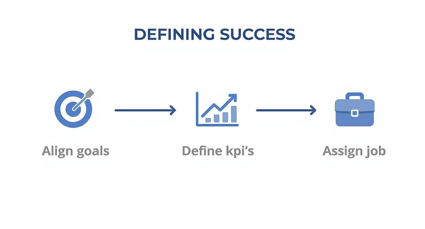
It’s all about making sure every metric you track has a clear purpose before you even open a tool.
Diving Deep with Custom GA4 Reports
Once your custom events are firing, don't get stuck in the standard GA4 reports. The best insights for content marketers are almost always hiding in the "Explore" section. This is where you can build custom reports that slice and dice your data to find what truly matters.
For instance, build a landing page report that shows not just sessions, but also the specific conversion events each page drove. This view instantly puts a spotlight on your most valuable content—the pieces that don't just attract eyeballs but actually turn them into prospects.
Uncovering User Intent with Google Search Console
While GA4 tells you what people do on your site, Google Search Console (GSC) tells you how they found you in the first place. This tool is an absolute goldmine for understanding user intent.
Instead of just glancing at your top pages, dig into the query data for a specific URL. You'll often discover an article is ranking for dozens of long-tail keywords you never even thought to target. These queries are the exact questions your audience is asking, giving you a crystal-clear roadmap for updating your content to meet their needs.
GSC is also where you can get a pulse on your content's authority and visibility. Strong performance here often goes hand-in-hand with a healthy backlink profile. If you're serious about growing your site's credibility, you need to understand your Domain Authority and how to improve it.
Connecting the Dots with CRM Integration
The final piece of the puzzle is closing the loop between a first click and a new customer. Integrating your analytics with a CRM like HubSpot is how you connect anonymous website visits to real people and, ultimately, to revenue.
This connection unlocks full-funnel attribution. Suddenly, you can see not just the blog post a customer read right before they signed up, but also the article they read three months earlier that started their entire journey. This is the kind of insight that empowers you to make truly strategic decisions about where to invest your content budget for maximum ROI.
The industry is already moving in this direction. In 2025, engagement metrics are the most tracked indicators of content performance, with 53% of marketers globally watching social media and website engagement as their top KPIs. This shows a clear shift away from vanity metrics and toward genuine audience interaction. If you're looking to get ahead of the curve, you might want to explore how to use AI for performance data analytics to sharpen your measurement capabilities even further.
Finding Actionable Insights in Your Data
So, your measurement tools are set up and the data is finally pouring in. But here's the thing: a dashboard full of numbers is just noise until you learn how to pull a clear story out of it. This is where you graduate from seeing what is happening to truly understanding why it's happening—and that's the secret to making smarter calls on your content strategy.
Real analysis isn't about staring at every single metric. It's about asking the right questions, slicing up your data in meaningful ways, and connecting the dots that others miss. I’ve found that the best way to do this is by breaking down your data into three core pillars: Traffic, Engagement, and Conversions.

Unpacking Your Traffic Sources
First things first, you need to understand where your audience is coming from. Don't just glance at the total number of sessions and call it a day. The real gold is in segmenting that traffic by source to see which channels are actually driving growth.
Is your organic traffic climbing steadily month-over-month? That’s a great sign your SEO work is paying off. Seeing an unusually high amount of direct traffic? This could mean your brand is becoming more recognizable, and people are typing your URL right into their browser.
You're looking for patterns and outliers. Ask yourself:
Which channels bring in the most new users? This shows you where people are discovering your brand for the first time.
Do certain content formats work better on specific channels? Maybe your long-form guides are killing it in organic search, while case studies get all the love from your email list.
Did a specific article suddenly get a rush of social traffic? It might be worth putting a little ad spend behind it to ride the wave.
This first layer of analysis shows you which levers are actually working to bring people in the door, so you know exactly where to focus your promotional efforts.
Analyzing User Engagement On-Page
Once someone lands on your content, what do they do? This is where engagement analysis gives you a peek into the user experience and how valuable your content really is. High traffic with abysmal engagement is a huge red flag.
Metrics like Time on Page and Scroll Depth are your best friends here. A low average time on page for a 3,000-word deep dive tells you there's a disconnect. Either your intro didn't grab them, or the content just didn't live up to the promise of its headline.
Your goal isn't just to get a click; it's to earn the reader's attention. If a user lands on your article and bounces in 10 seconds, Google notices. Consistently poor engagement can signal to search engines that your page isn't a good answer for a given query, potentially harming your rankings over time.
This is also where you can diagnose problems with your content's structure. If you look at a heatmap and see everyone dropping off right before a critical section, you might need to add better subheadings, more white space, or a compelling image to break things up.
Tying Content to Conversions
This is it—the most important piece of the puzzle. You have to connect your content directly to business value. Traffic and engagement are nice, but conversions are what justify your budget and prove your ROI.
The entire industry is shifting this way. In fact, 34% of marketing leaders now cite conversion rates as their main measure of content success. This is backed up by data showing that 50% of marketers also track leads and 41% track sales coming from their content. The demand for measurable results is real. You can see more on this trend in recent content marketing statistics.
To get this data for yourself, just run a landing page report in GA4 and filter for your key conversion events, like "demo_request" or "trial_signup." This will instantly show you which articles are your true powerhouses—the ones consistently turning readers into leads.
A Real-World Diagnostic Scenario
Let's walk through a classic problem. Imagine you have a blog post that ranks #1 for a massive keyword. It pulls in 10,000 organic visits a month, which looks amazing on paper, but it has a conversion rate of nearly zero. It's a frustrating spot to be in.
Here’s how I’d break it down to find the "why":
Analyze the Search Intent: First, I'd dive into Google Search Console. What are the specific long-tail queries people are using to find this page? You might find the keyword has purely informational intent, meaning it attracts researchers, not buyers. It's a classic case of an audience-content mismatch. Doing some deep long-tail keyword research can help you avoid this on future articles.
Review On-Page CTAs: Next, look at your call-to-action. Is it aligned with the content? An educational, top-of-funnel article on "what is project management" isn't going to get many clicks on a hard-sell "Book a Demo" CTA. A softer offer, like a downloadable template or a checklist, would be a much better fit for where the reader is in their journey.
Evaluate Content Attribution: Finally, think about where this article really fits in the customer's path. It might not be a "last-touch" conversion piece, but it could be the crucial first touchpoint that introduces your brand to thousands of potential customers. Using a multi-touch attribution model in your analytics can help reveal its true value as an awareness-builder.
Building Reports That Actually Drive Decisions
Let's be honest: data is useless if it's just sitting in a spreadsheet or a messy analytics platform nobody can decipher. The real magic happens when you can translate all those numbers into clear, compelling reports that spark action. Your goal isn't just to dump data on your team; it's to tell a story about what’s working, what's not, and where you're headed next.
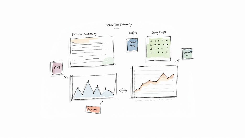
This is the point where you shift from being a data collector to a strategic advisor. A flat statement like, "Blog traffic is up 15%," is easily forgotten. But framing it as a narrative—"Our new AI integration series drove a 15% traffic increase from organic search, resulting in 25 new trial sign-ups"—is something your CEO will actually remember. That’s the difference between data and a story.
From Data Points to a Cohesive Narrative
The most effective reports I’ve ever built follow a simple, logical flow. They guide the reader from the big-picture outcomes down to specific, tangible recommendations. Instead of just throwing a bunch of charts at someone, you’re building an argument that makes your conclusions feel inevitable.
A solid monthly content performance report should always hit these key points:
Executive Summary: Start with a one-paragraph gut-check right at the top. What's the single most important takeaway from this month's data?
KPI Progress: Show how you’re tracking against the goals you set. Simple visuals work best here to show progress toward targets like trial sign-ups or MQLs.
Key Wins and Learnings: What knocked it out of the park? What was a surprising flop? This is your chance to explain the why behind the numbers.
Actionable Recommendations: Based on everything you just shared, what are the concrete steps the team should take next month? This is what turns a historical document into a strategic plan.
Your report’s primary job is to answer three questions for leadership: "What happened?", "Why did it happen?", and "What should we do about it?" If your report doesn't clearly answer all three, it’s not finished yet.
Building Your Content Performance Dashboard
For keeping a finger on the pulse day-to-day, a live dashboard is a must. While there are tons of tools out there, Google Looker Studio (formerly Data Studio) is a fantastic free option for pulling data from GA4 and Search Console into one visual space. The key is to curate, not overwhelm.
Here’s what a simple but powerful content dashboard could look like:
Top-Level KPIs: Put your most important metrics—like Organic Traffic, Leads from Content, and Conversion Rate—in big, bold numbers right at the top.
Trend Lines: Use line charts to show how your main KPIs have performed over the last 90 days. Are you trending up or down?
Top Performing Content: A simple table showing your top 5-10 pages by traffic, conversions, and engagement. This instantly tells you what's hitting the mark.
Channel Breakdown: A pie chart is perfect for visualizing where your traffic is coming from (Organic, Direct, Social, etc.).
If you're more of a spreadsheet person, visualizing your key performance indicators is still crucial. You can learn how to create dynamic summaries with an Excel dashboard tutorial.
Ultimately, the goal is to make the data so intuitive that anyone can understand the main points in 60 seconds or less. This frees up precious meeting time for talking strategy, not explaining what a bar chart means.
Using Data to Iterate Your Content Strategy
Measurement isn't the finish line. Think of it as the feedback loop that powers your whole content engine. The insights you’ve gathered are worthless until you use them to make smarter, faster decisions. This is where you close the loop, turning historical data into a forward-looking strategy that actually gets better over time.
It all starts with a simple but powerful question: based on our data, what should we do more of, what should we do less of, and what needs fixing? This question forces you to stop just looking at reports and start actively optimizing. You're building a living content ecosystem, not just a static archive of old blog posts.
Conducting a Strategic Content Audit
One of the most valuable things you can do with your data is a regular content audit. Don't think of this as a painful, page-by-page slog. Instead, you're hunting for the outliers—the big wins and the surprising failures—because that's where the real lessons are. You're looking for those high-potential pieces where a small refresh could send them flying to the top of the search results.
A great place to start is in Google Search Console. Look for articles with high impressions but a really low click-through rate. That's a classic sign of a strong ranking being held back by a weak headline or meta description. A quick rewrite could literally double its traffic. On the flip side, you're also searching for pages with tons of traffic but zero conversions, which tells you there's a serious disconnect between your content and your call-to-action.
The way we measure content performance has definitely shifted. With AI-driven personalization and the need to connect dots across channels, we've had to get smarter. Marketers are moving past vanity metrics and focusing on things like engaged sessions. These are visits that last longer than 10 seconds and involve some kind of user interaction, giving you a much truer signal of audience interest than just raw traffic. For a deeper dive, you can check out more on the top content marketing KPIs for 2025.
Using the Content Performance Matrix
To bring some structure to your audit, I use a simple framework I call the "Content Performance Matrix." It helps you bucket your content based on traffic and conversions, giving you a clear playbook for what to do with any given article.
Here’s a breakdown of the four quadrants:
High Traffic, High Conversions (Keep & Promote): These are your all-stars. You need to double down on these topics and formats. Promote them everywhere and treat them as the blueprint for future content.
High Traffic, Low Conversions (Update & Optimize): These articles are getting eyeballs but aren't closing the deal. The fix is usually on-page. Try refining the CTA, adding more relevant internal links, or embedding a lead magnet.
Low Traffic, High Conversions (Rewrite & Amplify): The message is clearly resonating, but not enough of the right people see it. This piece is begging for a significant rewrite to improve its SEO or a targeted promotion campaign to get it in front of the right audience.
Low Traffic, Low Conversions (Consolidate or Remove): This is the dead weight. The content is likely outdated or targeting the wrong keywords. Your best bet is often to consolidate several weak posts into one powerhouse article or just delete them to clean up your site architecture.
By systematically reviewing your data and taking action, you create a powerful cycle of continuous improvement. Each iteration makes your content strategy sharper, more efficient, and far more effective at driving real business growth.
Ready to stop guessing and start building a predictable content engine? Viral SEO gives you the tools to analyze your competitors, find high-impact content gaps, and optimize your strategy with real data. Start your free plan and accelerate your organic growth today.
Blogs
More Blogs
From keyword goldmines to AI-driven content hacks—expert insights to help your blog posts dominate the first page.


